Friday 18 December 2009

Curious Typography...


This was picked up by my sister Ella, who works as an editorial assistant for the Marine Biological Association. It's a scientific print found in the Royal Society Archives is from 1785 and contains some of the most wonderfully strange use of ligatures throughout the entire 59 pages of text. Very weird but quite beautiful I think.

Tuesday 15 December 2009

Book Crit With George H!


Such a lovely crit to end the term with. Everyone had worked so hard on their batch production project that the spread on books laid out on the table wouldn't have seemed out of place in one of those quirky little arty thing shops.


We delivered the fruits of our 3 week long labour at 10am sharp, and left George to consider them for an hour. Some books were picked out and placed into categories for comment, including as "exquisite" and "interesting idea" but also some stingers... "so what?" and "unfinished". Having produced 5 of each book, some controversial  editions even managed to traverse all of these categories.


In terms of my effort, a screenprinted & inkjet visual discussion on the future of the printing press, George briefly waved it about and deemed it "intriguing" – I'm pretty happy with that :)

Will get some nice photos of it together soon.

Monday 14 December 2009

A little bit of typographic rendering


Something I knocked up for my extension studies hand-in. Not what I had originally set out to create (see older posts) but a shortened deadline and technical issues forced what would have otherwise been real growth into virtually rendered growth. However the photograph I pulled apart and spread over the letters did come from the cress I grew myself in preliminary experiments.
 I intend to pursue with my original ideas in my own time to see what I can create.

Some Exciting News!


I was told on Thursday that the imagery I submitted for the Audio brief was selected by the Brighton club as one of their next promotional listings posters along with illustrators Rhiannon, Dan & Ivan.

Along with the other finalists, the artwork I supplied (image above) will be circulated as an A3 fold out poster  – about 10,000 of them I think, sometime after the New Year.

From what I gather, Audio intend on exhibiting all the work chosen later next year, which will be great.

They selected the original image I created as part of my summer project for the poster, and chose to use the image that I developed based on that, for some Saturday night flyers this December. As good as this is, unfortunately they have daubed some rather clunky typography on the top of it and blanked out the face at the bottom with a clashing turquoise bar.


I don't mind really – I'm only to happy for the opportunity and perhaps it's a lesson in not being to precious about your work. I was assured that this had been a rushed job and I'm not angry about it. I just generally don't understand why so many clubs seem incessant on producing flyers that are the graphic equivalent of Haribo Starmix. At least Audio are trying to reach out a bit further by briefing students in the first place.

A big thanks to David Parr from Audio for organizing the competition and for the fun celebration drinks on Friday night.

Wednesday 2 December 2009

My trip to the printers


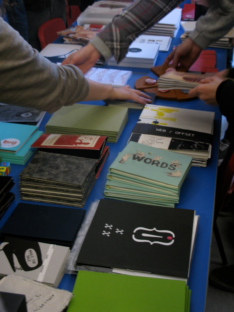
I owe an enormous thank you to the staff at Newquest Hampshire who were so nice to me today. Especially to Martin and Richard who toured me around the print hall this afternoon, and put up with my inane excitable noises and gasps every time we turned a corner. I was able to get some lovely photographs of the web offset presses in action, for my book.

These massive tanks are full of INK!


The ink is carried to the presses in the big coloured pipes, which just looks really cool... reminds me of something from Willy Wonka's factory. I really wanted one to burst....(the next bravia ad right there?)


The images are put onto aluminium plates, there are four plates for every page so the image is separated out into cyan, yellow, magenta and black. Then these are inked up and printed onto the gigantic rolls of news print. They are then folded and cut:


and transported through the building on a conveyer belt system like this:


And then they end up stacked and wrapped on palettes, ready to be delivered.

 
It was really interesting to see how print works on a massive industrial scale. All the waste from all the Newsquest print centres across the country is recycled including the aluminium plates.

The newsprint they print onto is 100% recycled, theres no virgin pulp at all. Despite this it was quite scary to see that before the men calibrating the registration of the print can give the word to start printing at full speed, the press is running for about 20 minutes (albeit on slow speed) printing hundreds, possibly thousands of copies which go straight off the press into the recycling.
I was also shown the printing schedule for the presses – one from 2004, which was completely choc-a-bloc, 24/7 and included many national papers, but on the one for December 2009, the print run only spans just over 3 days, consisting of local papers and advert papers. I was told that there had been quite a few redundancies recently.

The amount of technology that has been developed for the papers to be printed as fast and as efficiently as they are, is really quite incredible. It would be a shame if it was no longer required.

Saturday 28 November 2009

Sometimes I wish I was born in the fifties....


Our final project of 2009 is now underway - batch production. Make 5 books for 5 pounds, and look at the word 'book' in the loosed sense of the term. It's such a lovely project that was introduced to us by the incredible Professor George Hardie, who was responsible for this


amongst so much more amazing work. After the lecture, a few of us were discussing it and I just thought about how I almost wish I had been brought up 4 decades earlier, and been working at the time George Hardie was. People asked why, and I felt it was because you could design things - posters, album sleeves, books, and that on its own was enough. 

You could be a master craftsperson of the printed page, and no one cared if you could make a flashing-glittery-viral-interactive-social-network-integrated-ad-campaign. I don't resent screen based design or the progression of technology - without this need to make better our ways of disseminating information, the printing press would never have been invented in the first place. Neither am I denying the environmental consequences of print. However it's nice to spend sometime recalling the beauty what what is seen by many as a dying artform. 

This is what I plan to do in my book, through the use of both collages of classic diagrams and manuals plus my own photographs which I will be taking on Wednessday when I travel to the Newsquest print centre in Southampton for research. 

Personally I'm hoping that even though there will be less printed media in the near future, it will mean what is printed will be better quality and designers will have to think much harder about it. Maybe those who take the time to learn the process inside out, will be all the more valued. As to whether this will actually happen, I'm guessing my generation of designers will be the ones to find out.

Monday 16 November 2009

All You Need Is...a few white walls and some free alcohol

...to tempt people into submitting some artwork. So Saturday night was a great success! We had a chance to pat ourselves on the back and say "arn't we just talented?" at the opening night of the exhibition titled "All You Need Is..." organised by Pat Bradbury and other Brighton Uni Illustration students at the Artist's Residence B&B.


I was excited to have the opportunity to present something on actual-real-paper instead of pixels, and so I submitted an (albeit rushed) but I think just about satisfactory piece of work in response to the brief. It attempted, via a subverted diagram of military ration pack menu variations, to make a comment on the disposable nature of the human beings we send into war-zones and the quantities we discuss them in, similar to the 5000 calories soldiers are attempted to tot up each day. Yes indeed. Suffice to say it may have been a bit far fetched – but hopefully the image could stand alone as something which looks interesting and might raise a question, even if that may be "Ally what the hell is this about?".

More images of work here


Friday 13 November 2009

Wired Sussex Portfolio Clinic


Last night I headed to the Corn Exchange to attend Wired Sussex's portfolio clinic. A wide range of different digital design agencies attended to offer up their wisdoms on how to be more successful in applying for work (or in my case internships) and how to get the most out of your portfolio.
It was a very popular event so most of my time was spent in a que to speak to designers but it was without a doubt worth my while.

I spoke to 3 agencies based in Brighton or surrounding areas – Preview,  Red Design and Crush.

They were all very encouraging and supportive of the work I showed them, and it's always nice to get feedback from somebody in industry who isn't one of your tutors and will judge your work solely on face value, without any bias towards a pre-established understanding of you as a student.

The main pieces of advice I took away from the event were

  • Always push yourself as much as possible – pick the hardest most challenging briefs you can, and don't be put off by that.This being the kind of tutorial advice than can be difficult advice to follow when faced with a looming deadline but it's inspiring to have this message echoed by designers working in industry.
  • That designers love to get things through the post and sending out things can be much more effective than an e-mail sometimes.
  • That most agencies do actually bother to look at the pdf's you send them, and that it's still a good way of finding work experience. 
  • Keep at it!
Theres a lot to be said for having these people give you the time of day, sometimes it's all you need to push you further.

Friday 6 November 2009

Audio Brief


A live brief set by the Brighton club, Audio to create the imagery for their monthly listings poster.
I'm currently working into some of the imagery I produced over the summer, with photographs of random textures scanned and manipulated in photoshop.
They are looking for something "left-field" and interesting, I'm guessing along the lines of Village Green's series of posters for Fabric in London.
As a started point I was inspired by these images I saw at the Photographer's Gallery a few years ago of supposed 'ectoplasm', a material produced out of the orifices of seance participants.


I'm quite skeptical about how real these are but I thought the imagery could be reinterpreted in an interesting way. Francis Bacon supposedly also interpreted these photographs for his piece "Three Studies for Figures at the Base of a Crucifixion".

These needs working into more but that basic feel of it is starting to look this this:


Thanks to lovely Sally for letting me use her face!

Work is ongoing.....

Tuesday 3 November 2009

More than just a pretty face...


Beautiful AND intelligent! This flickr set displays some of the loveliest photos of slime mold (not actually mold, it's just a living organism that uses spores to reproduce). They can solve mazes in order to seek out their food, and apparently also have the capability for short term memory. In experiments where a slime mold that did like light was placed in a box, it learnt to shrink down (as if cowering) when the lid was opened, even when the lid was opened in a dark room. Amazing! I'm hoping to use this for an art & science collaborative project (a selected bolt-on to my degree) in some way....perhaps developing on the ideas of natural graffiti such as this lovely typographic work by Anna Garforth


I find really exciting the idea that you can still have the freedom of expression in chance dialogues with the public that comes from graffiti, but in a non-vandalistic, non-permanent way. I'm also inspired by the possibility that the message could interact with the environment and medium in some way. Much more development is needed but the results may be exciting!

Friday 16 October 2009

If you've got time to kill...

Delicious.

Research for our latest brief on sequences revealed some pretty funny examples of miscommunication.

...hilarity ensues here

Wednesday 7 October 2009

Pictorial Knowledge...

Clearing out stuff to go back to uni I found these lovely fold out diagrams in the back of some old encyclopedias, called "Pictorial Knowledge" published in the 1930's (of which I discovered Enid Blyton was an associate editor...). All the body parts that fold out have the inverse printed on them, everything delicately and elegantly labeled. If only school textbooks looked like this nowadays...


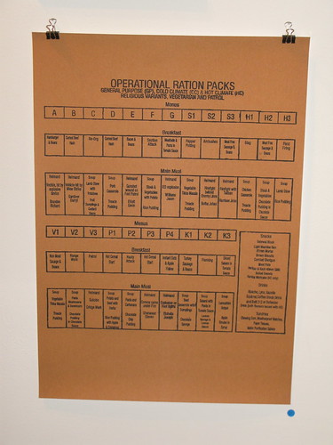
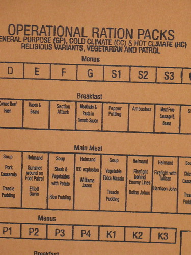
It could be interesting to try and recreate these using a modern subject matter...

OPEN DAY!


Pinatas, string, bathtubs, paper explosions and ice creams were all thrown into the ideas pot by Sally and myself in response to the very open open day poster brief last week......however we settled on the [seemingly] more simple concept of cracking open a chicken's egg....

A make shift studio set-up in my room was assembled for some test shots, with some of the results being rather lovely...

The concept is one of freshness, vibrancy and new beginnings, releasing the good stuff inside, encouraging people to make mistakes in their creative development ("you can't make an omelet without cracking eggs") etc etc, that in Brighton you can "break out of your shell" and experience a "free range education" – we could go on. The real challenge was to get an amazing image to back this up.
Several hours and too many eggs later, and as we are adding the type, it's all starting to come together.

After the final crit, one teams design will be chosen and 500 copies will be sent out to collages across the country.....fingers crossed......


Thursday 17 September 2009

Summer Project

As part of the Brighton University, BA (Hons) Graphic Design, 2nd year,  rather ambiguous, rather frustrating, rather mystifying, summer project, entitled 'Animal, Vegetable & Mineral' I have been looking at the humble apple. 
After creating an obsessive list about every single kind of pop culture/scientific/literary reference to the apple (there are very many, for example, I was unaware of the rather sweet practice of 'Apple Wassailing' – where cider farmers sing to their trees to bless them for a good harvest) I came across a book called 'The Apple in the Dark' by Clarice Lispector. 
Clarice Lispector was a Brazilian author and 'The Apple in the Dark' is the latest work to be translated, and is being published in a new edition by Haus Publishing
I was inspired by the lovely title of the book, and so have been working on a cover design for the book, using some photography as a basis. Some of my photos can be seen here.
Here are a few ideas.