We then developed this into the brand, our key ideas being to reference the Fluxus art movement but retaining accessibility through colour and typography. Very hectic over such a short timescale, but made me realise how much better I work when under pressure. There was some really amazing work across the course group — weeks like this one make me super proud to be in Brighton :). The logo was developed from the dots punched in an old pianola scroll found in a junk shop.
Sunday, 28 February 2010
Soundwaves Festival Rebranding
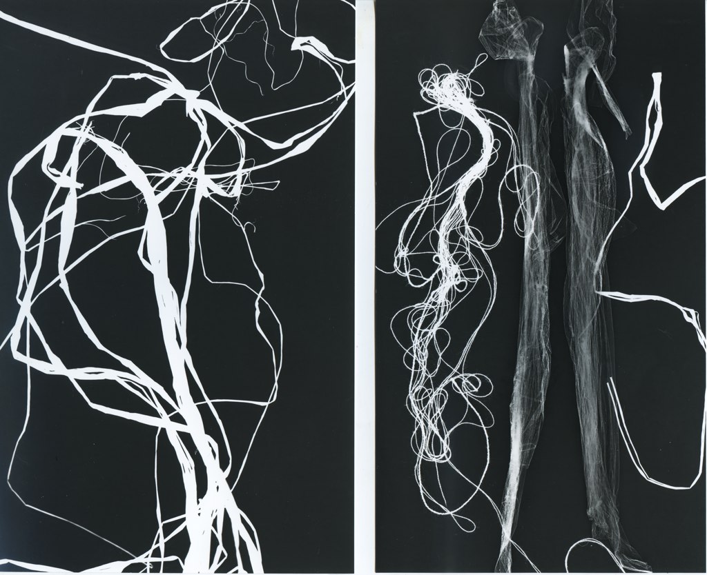
We were briefed by the Brighton experimental music festival, Soundwaves to give them a complete image overhaul, which they were well in need of looking at the previous publicity material they had been using. Working collaboratively with Kelly Satchell, in just 4 days came up with this concept, based around abstract imagery from photograms. Here a just a few of them:
We then developed this into the brand, our key ideas being to reference the Fluxus art movement but retaining accessibility through colour and typography. Very hectic over such a short timescale, but made me realise how much better I work when under pressure. There was some really amazing work across the course group — weeks like this one make me super proud to be in Brighton :). The logo was developed from the dots punched in an old pianola scroll found in a junk shop.
We then developed this into the brand, our key ideas being to reference the Fluxus art movement but retaining accessibility through colour and typography. Very hectic over such a short timescale, but made me realise how much better I work when under pressure. There was some really amazing work across the course group — weeks like this one make me super proud to be in Brighton :). The logo was developed from the dots punched in an old pianola scroll found in a junk shop.
Saturday, 27 February 2010
What I have been doing for the last five weeks.
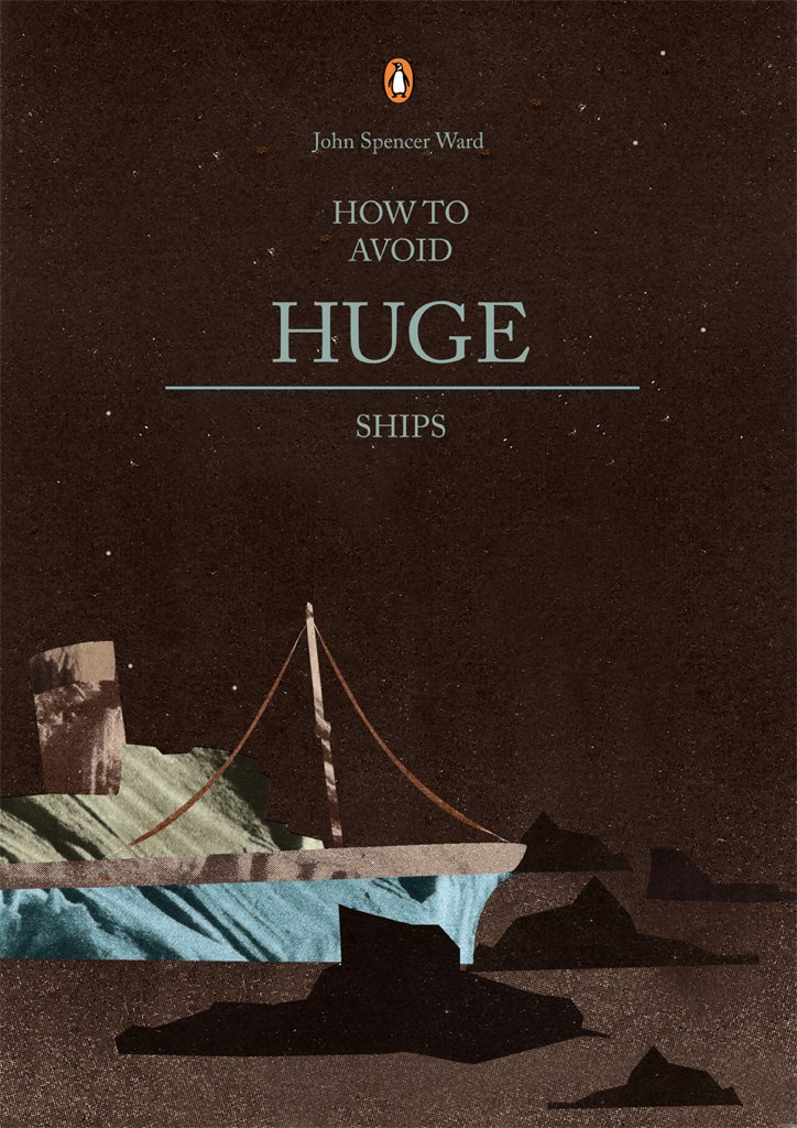
Amongst a lot of other things, we had a project to redesign 3 book covers and make 3 posters also, from the list of winners of the award for the strangest book title of the year. Here are two of mine until I get photographs of the actual books. Format was dictated to us (1 had to be collage, 1 hand drawn and 1 photograph). Most of us felt dictating the medium before the idea was formed went against all we have been taught previously. So not ecstatically happy with them but learnt quite a lot I think.
Tattooed Mountain Women and the Spoon Boxes of Dagestan
How to Avoid Huge Ships
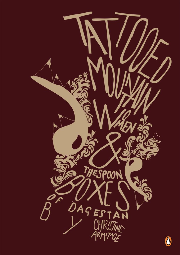
Tattooed Mountain Women and the Spoon Boxes of Dagestan
How to Avoid Huge Ships


Another big book...
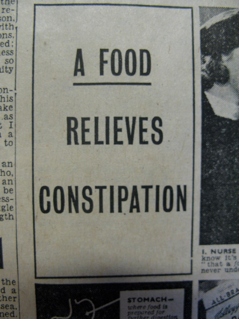
Having a bit of a thing with MASSIVE books at the moment, clearly. Here's one we found in the uni library, a huge collection of broadsheets from the second world war that have been bound together! It's pretty amazing. Found some nice type in there too. Reference only though, unsurprisingly!
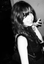
Here I am trying to lift said book, with difficulty.
And some interesting ads from inside it, I particularly like this:
Here I am trying to lift said book, with difficulty.
And some interesting ads from inside it, I particularly like this:
Friday, 12 February 2010
V&A Brief
Our course has been offered the opportunity to create a piece of work in response to something in the V&A collection, to demonstrate how it can be used as an inspirational resource. If the work is chosen, it will be put into an exhibition at the V&A in June. Very exciting! A collaboration with Kelly Satchell and Abby Byrne, our idea is a piece inspired by this amazing massive Qur'an from the 14th Century. Will be interesting if it all comes together.
Wednesday, 3 February 2010
Grandma's Hand
Why don't people write like this anymore? With ink pens? I have always been jealous of people who have beautiful handwriting. Maybe it's the biro's fault.
I found this in an old book that used to be my Grandma's and it just occurred to me how pretty it was. My handwriting seems to change everyday, is half joined up and half not, and tends to alternate between lowercase and uppercase within words, generally making me look like a 14 year-old on paper.
I found this in an old book that used to be my Grandma's and it just occurred to me how pretty it was. My handwriting seems to change everyday, is half joined up and half not, and tends to alternate between lowercase and uppercase within words, generally making me look like a 14 year-old on paper.
Subscribe to:
Comments (Atom)

