Thursday, 21 January 2010

Univers(al?)


The finished result from our latest project brief. Everyone had to pick a typeface out of the hat and create a purely typographic page for a broadsheet newspaper to support their typeface. We also had to write some informative (but lively) copy to accompany. This is my case for Univers — my elder male tutor felt uncomfortable, my younger female tutor enjoyed it. Funny that.


If, Helvetica is your comfiest pair of baggy M&S Y-fronts — the ultimate utility and the ever reliable fail-safe in times of indecision — then Univers is your best fitting shortbreifs. They are cotton and comfortable, but black, with a touch of french lace trimming.
Designer Adrian Frutiger honed his machinist masterpiece for type foundry Deberny & Peignot in 1957. Educated in Zurich, Frutiger’s Univers was built upon Swiss objectivity. With the enormous variety of different weights, he has achieved a careful balance between unity and diversity.
The elegant detail (the lace trimming if you will) can be found in the condensed weights, which hail the French cinema posters of the 1970s. Currently enjoying a revival, ultra condensed Univers can regularly be seen at 200pt running into monochrome photography in an offbeat fashion magazine.
The comfy part that hugs your bum will be found in Athens International Airport, directing you to baggage reclaim. Or pinned to the side of a Westminster building confirming your successful location of Oxford Street. Univers’ expressively intentional anonymity – it’s sincere, clean geometric forms – make it part of the handful of typefaces considered the best for signage and wayfinding systems.
Despite its beautifully diverse functionality, Univers will sit comfortably on your skin, and wouldn’t dare cause a wedgie. It can be void of personality and blend seemlessly into well designed surroundings. It can be a dramatic centre piece to a page spread, or — exercising it’s full variety of stroke widths — can create dynamically intricate hierarchy systems. 
Time-of-the-month or a hot date, Univers does it all with style.


Friday, 15 January 2010

Eventually...

After having just about recovered from Christmas sluggishness, I  have managed to get into the studio and take some photographs of recent work. Last night I had some self indulgent fun updating my website, a welcome break from the headache inducing geometric-monochrome-ness of our type layout project.


Friday, 18 December 2009

Curious Typography...


This was picked up by my sister Ella, who works as an editorial assistant for the Marine Biological Association. It's a scientific print found in the Royal Society Archives is from 1785 and contains some of the most wonderfully strange use of ligatures throughout the entire 59 pages of text. Very weird but quite beautiful I think.

Tuesday, 15 December 2009

Book Crit With George H!


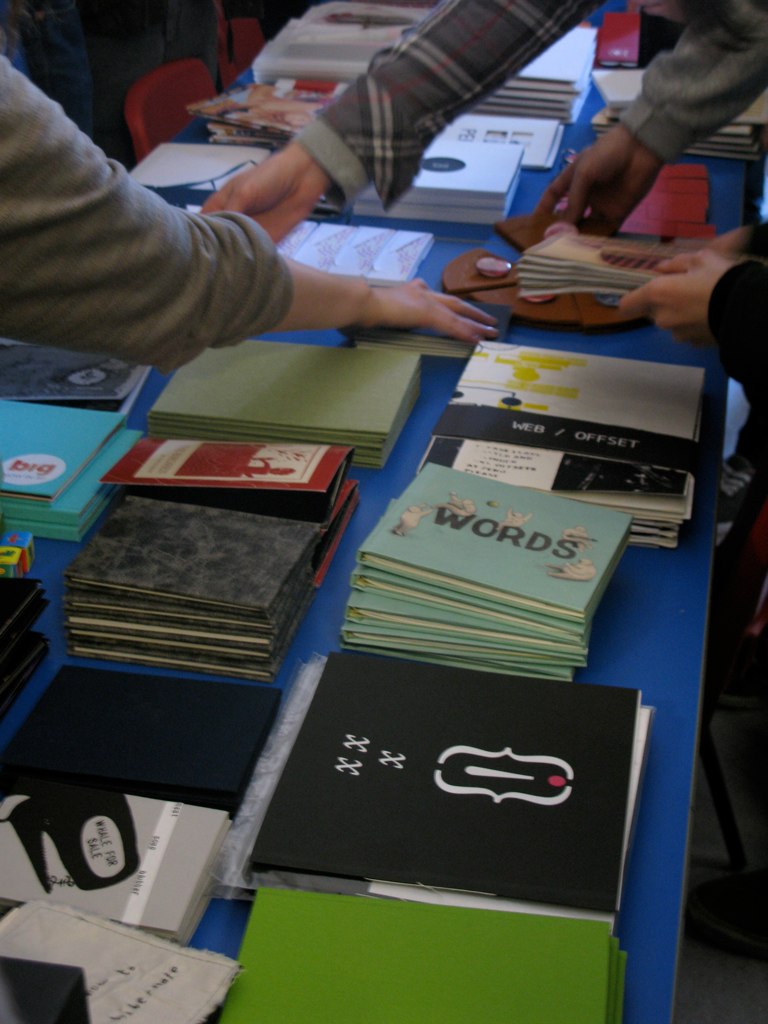
Such a lovely crit to end the term with. Everyone had worked so hard on their batch production project that the spread on books laid out on the table wouldn't have seemed out of place in one of those quirky little arty thing shops.


We delivered the fruits of our 3 week long labour at 10am sharp, and left George to consider them for an hour. Some books were picked out and placed into categories for comment, including as "exquisite" and "interesting idea" but also some stingers... "so what?" and "unfinished". Having produced 5 of each book, some controversial  editions even managed to traverse all of these categories.


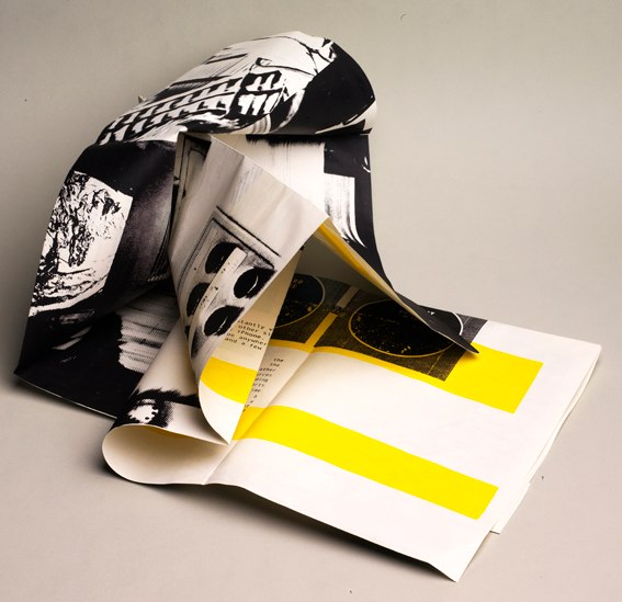
In terms of my effort, a screenprinted & inkjet visual discussion on the future of the printing press, George briefly waved it about and deemed it "intriguing" – I'm pretty happy with that :)

Will get some nice photos of it together soon.

Monday, 14 December 2009

A little bit of typographic rendering


Something I knocked up for my extension studies hand-in. Not what I had originally set out to create (see older posts) but a shortened deadline and technical issues forced what would have otherwise been real growth into virtually rendered growth. However the photograph I pulled apart and spread over the letters did come from the cress I grew myself in preliminary experiments.
 I intend to pursue with my original ideas in my own time to see what I can create.

Some Exciting News!


I was told on Thursday that the imagery I submitted for the Audio brief was selected by the Brighton club as one of their next promotional listings posters along with illustrators Rhiannon, Dan & Ivan.

Along with the other finalists, the artwork I supplied (image above) will be circulated as an A3 fold out poster  – about 10,000 of them I think, sometime after the New Year.

From what I gather, Audio intend on exhibiting all the work chosen later next year, which will be great.

They selected the original image I created as part of my summer project for the poster, and chose to use the image that I developed based on that, for some Saturday night flyers this December. As good as this is, unfortunately they have daubed some rather clunky typography on the top of it and blanked out the face at the bottom with a clashing turquoise bar.


I don't mind really – I'm only to happy for the opportunity and perhaps it's a lesson in not being to precious about your work. I was assured that this had been a rushed job and I'm not angry about it. I just generally don't understand why so many clubs seem incessant on producing flyers that are the graphic equivalent of Haribo Starmix. At least Audio are trying to reach out a bit further by briefing students in the first place.

A big thanks to David Parr from Audio for organizing the competition and for the fun celebration drinks on Friday night.

Wednesday, 2 December 2009

My trip to the printers


I owe an enormous thank you to the staff at Newquest Hampshire who were so nice to me today. Especially to Martin and Richard who toured me around the print hall this afternoon, and put up with my inane excitable noises and gasps every time we turned a corner. I was able to get some lovely photographs of the web offset presses in action, for my book.

These massive tanks are full of INK!


The ink is carried to the presses in the big coloured pipes, which just looks really cool... reminds me of something from Willy Wonka's factory. I really wanted one to burst....(the next bravia ad right there?)


The images are put onto aluminium plates, there are four plates for every page so the image is separated out into cyan, yellow, magenta and black. Then these are inked up and printed onto the gigantic rolls of news print. They are then folded and cut:


and transported through the building on a conveyer belt system like this:


And then they end up stacked and wrapped on palettes, ready to be delivered.

 
It was really interesting to see how print works on a massive industrial scale. All the waste from all the Newsquest print centres across the country is recycled including the aluminium plates.

The newsprint they print onto is 100% recycled, theres no virgin pulp at all. Despite this it was quite scary to see that before the men calibrating the registration of the print can give the word to start printing at full speed, the press is running for about 20 minutes (albeit on slow speed) printing hundreds, possibly thousands of copies which go straight off the press into the recycling.
I was also shown the printing schedule for the presses – one from 2004, which was completely choc-a-bloc, 24/7 and included many national papers, but on the one for December 2009, the print run only spans just over 3 days, consisting of local papers and advert papers. I was told that there had been quite a few redundancies recently.

The amount of technology that has been developed for the papers to be printed as fast and as efficiently as they are, is really quite incredible. It would be a shame if it was no longer required.